PROJECT: User Research, Branding Guidelines, Wireframes, User Testing, and Interface Design
BRIEF: Stout Tanks came to MFD looking to better align with their target personas, increase visitors, online orders and conversions on their website through updated branding guidelines and a website update using their current framework and CMS.
Worked along side Giselle Waters (Content Strategist) and Andrée Valentine (Client Strategist)
Process: Phase 1 - Benchmarking and User Research
I worked along side a Content Strategist to benchmark the website including load times, website traffic and Google Analytic goals. We then performed a suite of usability testing including heatmaps, speaking with Brewers, the Stout Tanks sales team, running users through the site given a list of objectives to complete. We found:
• User felt the website looks dated and corporate.
• Only 50% understand what products/services are offered.
• It is unclear that the site belongs to an industry leader, with only 33% of those surveyed getting that impression.
• The navigation was overwhelming and the image was too dominant for a clear impression.
• Only 1/3 of those surveyed understood where to click to purchase a product.
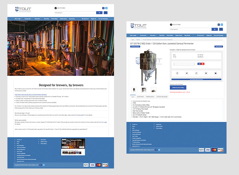
BEFORE
Process: Phase 2 - Branding and Wireframes
Stout Tank felt strongly about keeping the current logo, I made a few adjustments including updating the spacing and alignment of the tagline. I chose a color palette that represented the industry, along with a secondary palette that could be used for their additional services. The brand guidelines included typographic usage and photography styles for lifestyle and product shots.
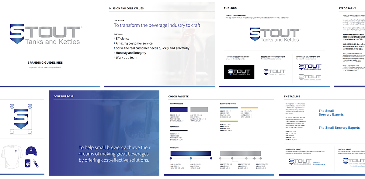
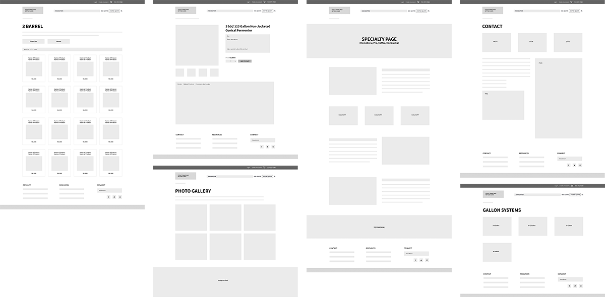
Wireframes were created to identify the user interface changes we recommended and aid in the content creation.
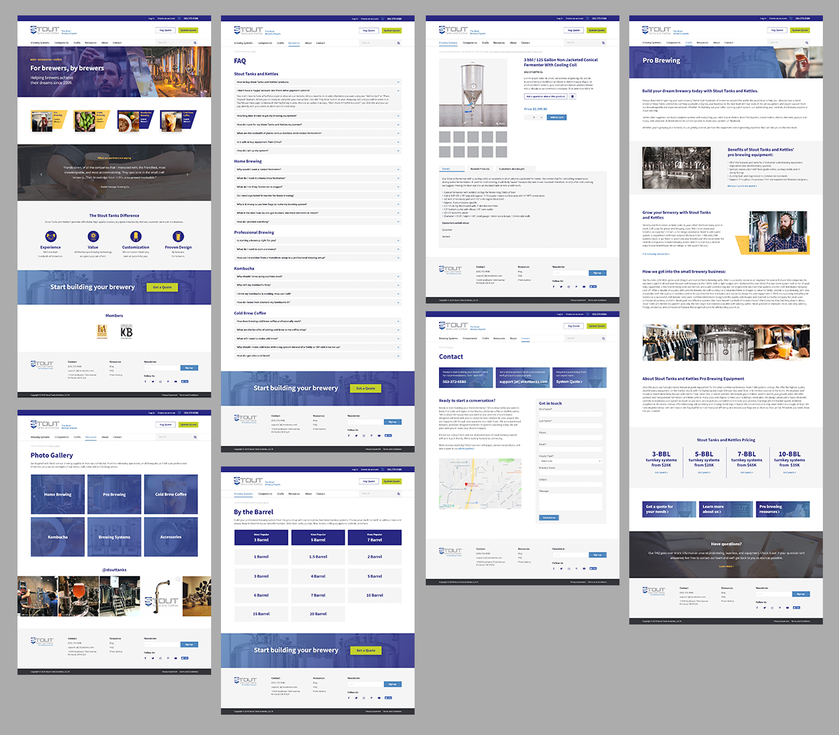
Process: Phase 3 - Design, User Testing, Hand-off, Quality Assurance Testing
During the design phase, we recreated the tests performed during Phase 1 to confirm the benefits of the updates.
The results of the new design:
• The website no longer looked data and corporate. Users stated, "It looks attractive and professional" and "I thought it was a good use of color and images. It really drew me in."
• 100% of users understood what products/services are offered.
Once the layouts were approved, we sent them off to the developers and provided quality assurance to confirm the development phase matched the mockups.
Wireframes were created to identify the user interface changes we recommended and aid in the content creation.